
It happens at least once a week. A song ends, and the next one starts — and it just fits. Not just the genre, but the mood, the tempo, the exact energy of your moment. You didn't ask for it. You might not have even known you wanted it. But Spotify did.
That feeling isn't random. As a product management student, I wanted to understand what's actually behind this experience — not just what Spotify recommends, but how it consistently gets it so right.
My Approach
I didn’t start with articles or theory. I started with the product itself, so I could form my own understanding before reading what others had to say.
Using the product first to explore Spotify recommendations without bias
Comparing user experiences to understand how listening behaviour shapes recommendations
Tracking changes over time instead of relying on a single snapshot
Referring to articles, videos, and documentation only after forming initial insights
Testing and validating patterns through real, everyday usage
Each step helped me understand what Spotify shows—and why.
Initial Findings
Before diving into any technical detail, there’s something most breakdowns miss: Spotify’s entire product — every feature, screen, and recommendation — is built around three core pillars.
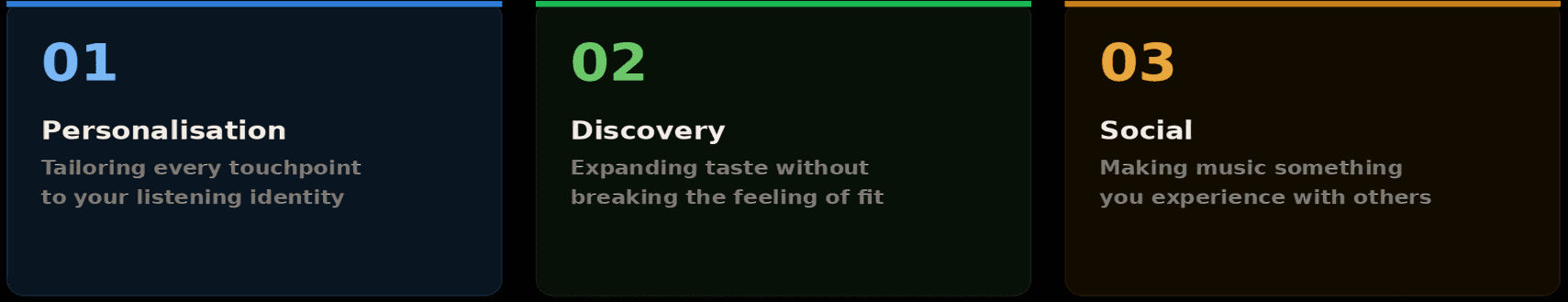
These pillars shape how Spotify feels so seamless and engaging. Once you see them, you start noticing that every feature is designed with one of these goals in mind.
Homepage Experience Flow
Take the homepage. It looks like a simple feed of playlists. But look carefully — it's structured as a spectrum that runs from deeply personal to openly exploratory as you scroll down.
Top: Fully personalised (recent listens, Jump Back In)
Middle: A mix of personalisation and discovery (Daily Mixes, Artist Radio)
Bottom: Pure discovery (Discover Weekly, regional picks)
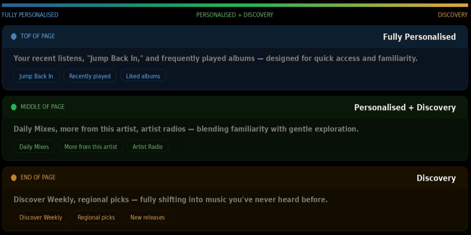
This layout gently guides users from the comfort of familiar content to the exploration of new music, making discovery feel natural rather than forced.
date published
Mar 30, 2026
reading time
5 min


